
Little Ramen Shop needed a Custom Logo Design
Our client clearly knows how to get a good logo design, because his instructions were right on the money!
Slogan: 小さなラーメン屋
The slogan posted above is Japanese for “Little Ramen Shop”, so that needs to be put in somewhere small, but readable. I’m in need of two different styles:
1) Fun and pop-oriented.
2) Traditional and safe.
We’re on the fence as to whether we’ll be going a traditional japanese style inside the restaurant, or if we’ll be going for something more modern, fun and quirky. Because of this indecision, I’d like you to provide some ideas for how a logo would look considering both.
Japan has a varied culture, and we’re looking to tap into the parts of this culture that are found strange and interesting to westerners. Examples include: Anime, Company Mascots, Neon lights of Tokyo, Mt.Fuji, Harajuku Girls, J-POP.
It’s a Ramen shop, so we’re serving Japanese noodle soups. The bowls are therefore quite important, and a bowl could be part of the logo in some way.
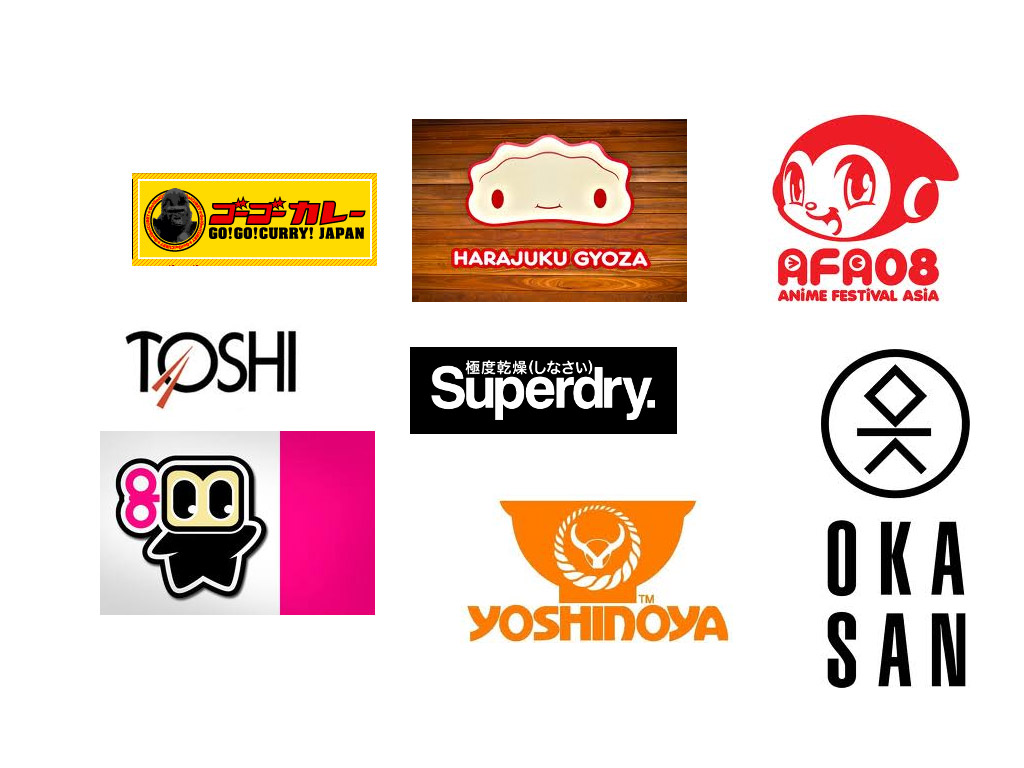
I have attached a few examples.
…and here are some of the examples our client shared with us, so we could see what typical logos are like:
We kept our designs friendly like in the examples, but at the same time a bit serious to cover both the fun and traditional requirements. The logos thus had the style that Little Ramen Shop’s customers expected to see.
Logo Version 2

Logo Version 3
Logo Version 4
Logo Version 5
It all comes down to taste, and while there were already some logos we really liked, upon review our client decided to change the name of the company and ordered
even more logo variations.
A good company image requires both: a company name, which tells potential clients something about the company, and a logo that creates an immediate like/dislike or for-me/not-for-me feeling for a potential customer.
…create another 3, starting with the black and white one and going from there with some more resources.
Logo Version 6

Logo Version 7
Logo Version 8
Our client wasn’t settled on any of these. At this point he wanted to see a big emphasis on the colour red, and more design options. We want our clients to be happy, so we presented
even more logo variations for Little Ramen Bar.
Logo Version 9

Logo Version 10
Logo Version 11

Logo Version 12

Logo Version 13
Logo Version 14 – a fun logo for a bit of contrast
Logo Version 15
Logo Version 16
One of them the client loved, and it went on to signage and menues.
Planning Your Logo?
As you look for a logo designer, keep in mind that a designer needs to pair creativity with great technical expertise. For example:
- If the wrong design program is used, your logo will blur when resized.
- If unprintable colors are used, your logo will look wrong when printed.
- If final quality control is skipped, your logo will have costly mistakes.
Business owner trying to save a few bucks just end up paying twice to redo their logo and reprint their marketing material. Avoid surprises, by learning about impossible colors, vector graphics, and the importance of quality control. Learn more

 We kept our designs friendly like in the examples, but at the same time a bit serious to cover both the fun and traditional requirements. The logos thus had the style that Little Ramen Shop’s customers expected to see.


 It all comes down to taste, and while there were already some logos we really liked, upon review our client decided to change the name of the company and ordered even more logo variations.
A good company image requires both: a company name, which tells potential clients something about the company, and a logo that creates an immediate like/dislike or for-me/not-for-me feeling for a potential customer.


 Our client wasn’t settled on any of these. At this point he wanted to see a big emphasis on the colour red, and more design options. We want our clients to be happy, so we presented even more logo variations for Little Ramen Bar.


 One of them the client loved, and it went on to signage and menues.


