Hee-yaw, ladies and gents! We’re here for the 12th weekly roundup of logo designs that the Little Guys Logo team created and really loved. They’re definitely worth a second look, and maybe a third eyeful, if you got the time and desire to do so. Think of the gems of graphic design know-how you might glean from the images 😉
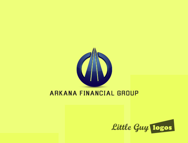
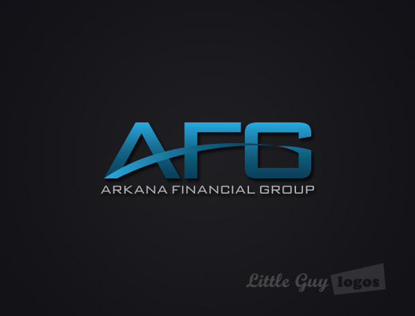
Arkana Financial Group
For nearly a decade now,
Arkana has been a tireless helping-hand to small businesses in Toronto. They offer their expertise in financial modeling, reporting, and budgeting to their clients.
Financial Company Logo
This design uses three vertical lines to form an arrow head, which breaks through the confines of the circle. An arrow that points upwards and seems to have gone beyond the limits imposed on it strongly suggests the kind of financial backing and expertise Arkana’s clients can expect from them. The lines also look like a skyscraper that’s reaching high into space, and the enveloping circle represents the support that Arkana Financial Group provides its clients as their companies grow.
Financial Company Logo 2
This version of Arkana’s logo features a stylized design for its acronym AFG. A blue strip forms a wide arc that connects the lowest left corner of the letter A to the curving lip of the letter G. The blue arc passes through the letter F and forms its lower arm. The arc represents the connecting relationships that are continually created and nurtured by financial companies like Arkana.
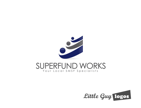
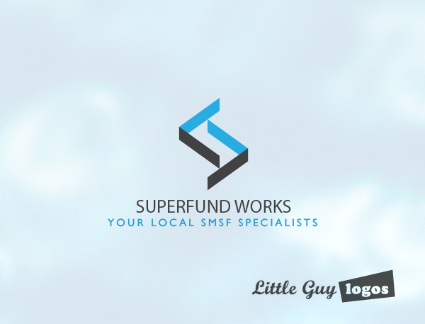
Superfund Works
Superfund Works is an accounting firm that offers a full range of services related to SMSF compliance and audits.
Personal Finance Company Logo
This logo design features three geometric figures of people in a relaxing pose as they watch their funds grow. Another interpretation for this logo is that the balls (funds) are now in the court of Superfund Works.
Personal Finance Company Logo 2
This variation on the Superfund Works logo uses a trio of rising vertical bars to represent financial reporting and a positive return-on-investment. A gray check mark represents the reviews and audits that have been followed. And the way it wraps around the bars elicits a feeling of protection.

Personal Finance Company Logo 3
The logo in the shape of an S stands for the company name. The geometric figure made of black and blue strips represents the intricate maze of the financial markets that the firm has to maneuver everyday.
Planning Your Logo?
As you look for a logo designer, keep in mind that a designer needs to pair creativity with great technical expertise. For example:
- If the wrong design program is used, your logo will blur when resized.
- If unprintable colors are used, your logo will look wrong when printed.
- If final quality control is skipped, your logo will have costly mistakes.
Business owner trying to save a few bucks just end up paying twice to redo their logo and reprint their marketing material. Avoid surprises, by learning about impossible colors, vector graphics, and the importance of quality control. Learn more


