We’re on our sixteenth weekly roundup of beautiful logo designs. Time flies! Out of the designs we’ve done this week, here are those that we love most. Check ’em out…
Shockwave
Shockwave is a logo done an extreme sports team – that of Canadian skydivers. They are skydiving professionals who have come together for the love of the sport and to help each other improve, and their members often compete in local and international tilts.
Skydiving Team Logo
This logo design uses curves to form an abstract shape of a skydiver rapidly descending through the air. The gray round shape is the head while the ends of the arcs represent the arms and legs spread wide while the skydiver is free-falling. The light grey arc below the skydiver is the shockwave created as the skydiver reachers mach 1 and breaks the sound-barrier. It’s a pretty kick-ass logo 😉

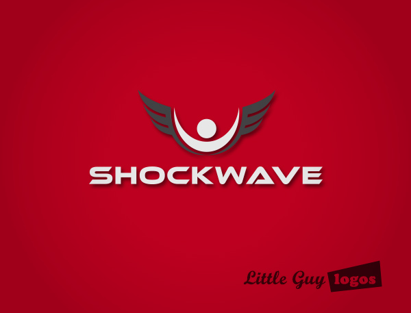
Skydiving Team Logo 2
In this Shockwave logo design we’ve got an abstract figure with wings. It associates the surreal sensation of flying and the sense of freedom that skydivers experience while skydiving.
WebinarFly
WebinarFly.com is a portal that helps users connect with webinars they are interested in learning from. It’s great for webinars, online training, digital hangouts and more.
Startup Logo Design
This wordmark logo design turns the letter A in webinar into a the “play” button you have come to associate with videos. Inside using negative space is a tiny rocket depicting flight.

Startup Logo Design 2
This variation of the WebinarFly logo depicts a hot air balloon that’s being carried into the air by several speech bubbles. The different bubbles represent the different discussion topics that and the individual communities that this platform plans to facilitate. It’s an abstract representation of the webinars and online meetings that this Chicago-based startup will be launching for its clients.

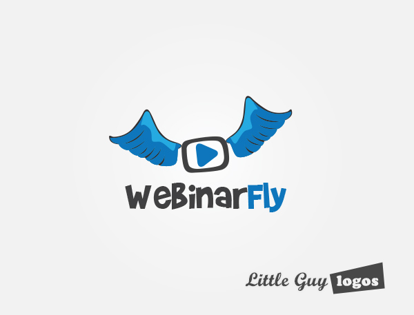
Website Logo 3
Here the concept of flight is represented with blue-tinged wings attached to a PLAY button inside a monitor. It’s a fun, cartoonish design that will appeal to a different (less professional) demographic. The text is “rough” and freehand-looking to match the mark.
Planning Your Logo?
As you look for a logo designer, keep in mind that a designer needs to pair creativity with great technical expertise. For example:
- If the wrong design program is used, your logo will blur when resized.
- If unprintable colors are used, your logo will look wrong when printed.
- If final quality control is skipped, your logo will have costly mistakes.
Business owner trying to save a few bucks just end up paying twice to redo their logo and reprint their marketing material. Avoid surprises, by learning about impossible colors, vector graphics, and the importance of quality control. Learn more


