Seventeen is the last of prime numbers. It’s a vibrant and distinct number that’s widely significant in pure math and applied sciences. Will the seventeenth weekly roundup of logo designs be as distinguished and mentally stimulating as its number seems to imply? See for yourselves and decide.
Ross Construction
Ross Construction is a professional builder of quality homes and office buildings.
Construction Logo
This logo design remodels the letter R as a couple of high-rise buildings, suggesting that no project is too big for Ross Construction. The test is bold both to suggest strength and security of the construction methods, but the text is also bold so that drivers passing by the project sites could easily make out the company name.

Creek 2 Coast Electrical
Creek2Coast Electrical provides ground-up construction, renovations, and switchgear installations to commercial and industrial clients.
Electrical Company Logo
The logo for Creek 2 Coast Electrical is designed to look mainly like an electrical plug. The top half looks like a long road to show the vast distances that need to be covered to deliver electricity. The perspective also shifts halfway through the logo. The top represents the creek, while the wavy line running across the log represents the shoreline, or the coast.

Electrical Company Logo Design 2
This design for the Creek2Coast logo uses its acronym C2C made out of a continuous line. This uninterrupted line represents the steady flow of electricity.

Vancouver Siding
Vancouver Siding is a home renovation company that provides exterior siding expertise to clients in Vancouver and area. They specialize in vinyl siding, fiber cement siding, James Hardie siding, aluminium siding, cedar siding and other wood siding installations.
Siding Company Logo
This is a facelift of their old logo. Basically it’s a logo of a house that prominently shows one side of the building – the one with the siding work done.

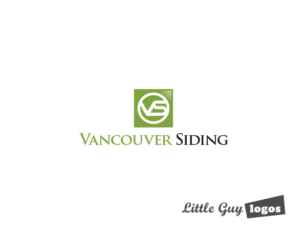
Construction Industry Logo 2
This could be used as a letter logo mark all on its own. The acronym VS of Vancouver Siding is used prominently inside a circle. It doesn’t have any particular symbolism, we just thought it looked cool.

Planning Your Logo?
As you look for a logo designer, keep in mind that a designer needs to pair creativity with great technical expertise. For example:
- If the wrong design program is used, your logo will blur when resized.
- If unprintable colors are used, your logo will look wrong when printed.
- If final quality control is skipped, your logo will have costly mistakes.
Business owner trying to save a few bucks just end up paying twice to redo their logo and reprint their marketing material. Avoid surprises, by learning about impossible colors, vector graphics, and the importance of quality control. Learn more


