It’s just 11 days before Christmas Day, folks! Have you already completed your shopping list for the holiday season? If you haven’t yet, then don’t be surprised when a beautifully organized chaos descends on our lives so suddenly. Understandably, everybody’s racing against time before the shops raised the retail prices of much sought-after products or before these Must-Buy items go out of stock.
Yet, never have we at Little Guys Logo missed publishing an end-of-the-week post – not even once – since we began rounding up these jaw-dropping logo designs in January this year. This 45th weekly lineup of logos not only showcases those designs that have been crafted with boundless passion, creativity, and expertise, but also displays an unsurpassed dedication to one’s work.
Tiro Jewelry
Tiro Jewelry is a high-end collection of handcrafted jewellery designed to fit the wearer’s personality. These limited-edition necklaces, earrings, bracelets, and rings have been created with precious stones and various metals.
Jewellery Wordmark
This Tiro Jewelry logo is a simple wordmark with light (golden yellow) and dark (midnight blue) versions. The logo design’s flexibility is a reflection of this custom jeweler’s artistic ability to create a magnificent piece of jewellery based on the customer’s background information and ideas.

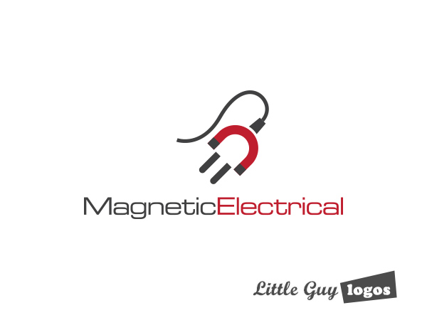
Magnetic Electrical
Magnetic Electrical offers domestic and commercial electrical services, including power grid upgrades or transfers, wiring and lighting installations, setups for CCTV videos and smoke alarms, and emergency repairs on switches, fans and power points. The firm also installs, cleans and fixes the swimming pool pumps and filters of their clients. Most of its clients in North Queensland, Australia are in the mining, materials processing, manufacturing, and mercantile sectors.
Electrical Company Logo
The logo design for this electrical services provider uses two objects, namely a horseshoe magnet with a red U-shaped body and two black tips, and a black electric plug. It also kind of looks like a person, and we liked this human component – it makes the logo look much friendlier.
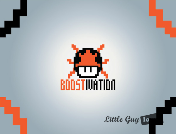
Boostivation
Boostivation is a Youtube channel with aims to grow into a full website that aims to inspire and motivate its viewers.
Motivational Channel Logo Design 1
This Boostivation logo is designed to remind us of the Power-Up Mushroom bonus from the classic NES game of
Super Mario Brothers. The pixelated image is a 2D composite of the funkie fungi that Mario gulps down for a short burst of energy.
In a similar sense, online viewers consume a small helping of “Yes, You Can!” and “Believe In Yourself” in affirmative messages after watching a series of feel-good videos via Boostivation’s YouTube channel. Consistent exposure to this electrifying “Kool-Aid” mixture of motivational and uplifting content (whether it’s curated or originally created) leads to internalization of these positive beliefs and attitudes.
Motivational Channel Logo Design 2
This logo design for Boostivation has a more contemporary illustration of the Power-Up Mushroom bonus similar to the one in the classic NES game –
Super Mario Bros. Mario eats it and enjoys a limited boost in speed, stamina, and strength. Channel viewers will get a similar boost from the short videos that were made to inspire and motivate.

AW Market
AW Market is an online store that sells different types of consumer electronics, such as cameras, speakers and video game consoles, at ridiculously cheap prices. They’re mostly virgin-return products, or items that customers barely used and returned to the seller after a few days. They’ve been professionally refurbished using manufacturer-authorized parts and processes.
Online Electronic Store Logo
The design for the AWMarket logo is a simple wordmark that’s divided into two parts: the large green AW and the stylized text for “market” that’s displayed in smaller letters with a shopping cart replacing the letter “a”. The first part has a fresh and edgy look that appeals to the masculine. Meanwhile, the second part uses a slightly tilted and rounded font that leans more toward the feminine aspect to balance this logo design.

Planning Your Logo?
As you look for a logo designer, keep in mind that a designer needs to pair creativity with great technical expertise. For example:
- If the wrong design program is used, your logo will blur when resized.
- If unprintable colors are used, your logo will look wrong when printed.
- If final quality control is skipped, your logo will have costly mistakes.
Business owner trying to save a few bucks just end up paying twice to redo their logo and reprint their marketing material. Avoid surprises, by learning about impossible colors, vector graphics, and the importance of quality control. Learn more


