Here’s a logo we enjoyed doing. It’s for a medical company that’s expanding and rolling out with a solid product in a niche market. Naturally to win customer confidence they need to look the part.
Instructions were fairly straight forward, though without a clear direction.
Kander Medical is a medical device company that sells products to men who suffer from urinary incontinence…
The theme of incontinence (inability to retain urine) could be used, but would have to be done in a respectful and appropriate manner. This is not a must, only a suggestion.
Appealing logo forms include letterform (motorola, univision), wordform (IBM, FedEx), or possibly something more abstract.
This logo will be used on the company website (which is still to be created), letterhead, business cards, and other misc. locations, so it needs to scale well. It may also be printed in black and white at times.
Since this is a sensitive issue for many men around the world, we wanted our logo to communicate confidence in the product and discretion. That meant avoiding wild colours, and choosing rich and deep colours instead. Overall we felt that a conservative logo was the way to go with medical symbolism. In addition to the above logo, we delivered these:
Logo Version 2

Logo Version 3

But then we thought some, and decided to deliver a more humorous design. We would like to think that men with this unfortunate condition have the wisdom to treat it with a bit of humour, but that may be just wishful thinking.
Logo Version 4 – With a Bit of Humour

Our client reviewed them all, and requested the following:
I like the concept for version 2. However, I would like a few changes:
– Could you match the blue color to the color in the ActiCuf logo exactly? See ActiCuf logo attachment.
– The black and blue aren’t working well together. Would you please change the black to be a medium gray? See the background color of this website [site url removed]
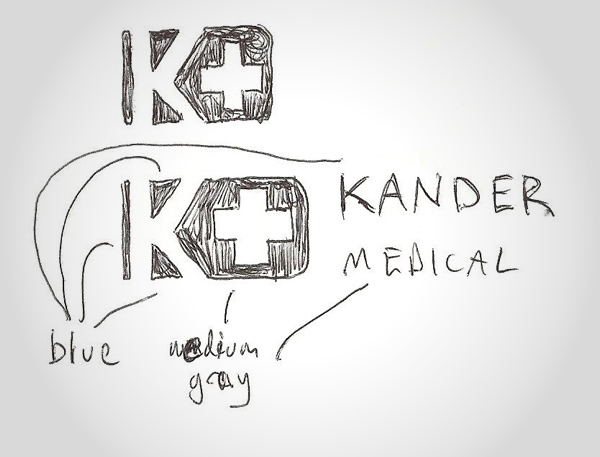
– I like the “+” sign, but it’s not quite prominent enough. Would you please make it bigger per the attached sketch?
– What font did you use for “Kander Medical?” It is good, I’m just curious.
– Would you please provide color as well as b/w files for the next review, and use pure white as a background.
In addition to the ActiCuf colour, our client attached a great drawing; showing exactly what he wanted us to do.

Easy instructions mean a quicker turnaround, so we promptly delivered:
Logo Revision

Another client got a sweet logo made by Little Guy Logos. It’s on to the next project for us…
Meanwhile if you’d like to find out more about the company, here’s a bit from the big boss:
Kander Medical is a company that manufactures and sells medical devices to men with urinary incontinence to help them manage their condition. Two million men in the United States experience loss of bladder control from disease or injury that results in involuntary urine leakage. Incontinence is an unfortunate condition that can at times cause social embarrassment and generally decrease someone’s quality of life. Kander Medical’s main product is called “ActiCuf Compression Pouch,” which is a combination penile clamp and absorbent attachment. Kander Medical’s mission is to help incontinence patients return to their active and fulfilling lifestyles.
Planning Your Logo?
As you look for a logo designer, keep in mind that a designer needs to pair creativity with great technical expertise. For example:
- If the wrong design program is used, your logo will blur when resized.
- If unprintable colors are used, your logo will look wrong when printed.
- If final quality control is skipped, your logo will have costly mistakes.
Business owner trying to save a few bucks just end up paying twice to redo their logo and reprint their marketing material. Avoid surprises, by learning about impossible colors, vector graphics, and the importance of quality control. Learn more
 Here’s a logo we enjoyed doing. It’s for a medical company that’s expanding and rolling out with a solid product in a niche market. Naturally to win customer confidence they need to look the part.
Instructions were fairly straight forward, though without a clear direction.

 But then we thought some, and decided to deliver a more humorous design. We would like to think that men with this unfortunate condition have the wisdom to treat it with a bit of humour, but that may be just wishful thinking.
 Our client reviewed them all, and requested the following:
 Easy instructions mean a quicker turnaround, so we promptly delivered:
 Another client got a sweet logo made by Little Guy Logos. It’s on to the next project for us…
Meanwhile if you’d like to find out more about the company, here’s a bit from the big boss:


