We’ve designed
a lot of logos for various companies and businesses over the years. Here are some of them:
Appidemix
We begin with an app development company logo. These are some of the logos we’ve designed for this company, including those designs we liked the most.
App Development Company Logo 1
Here’s a 3D-ish company logo design that combines a gear and the letter “a” to create the logomark for this business. The “a” as you probably guessed is for the company name, and the gear represents the building of something that is interactive – their chief service. It has many other meanings of course: Something that requires precision. Tinkering with something. Movement. That’s really the beauty of most imagery – the design will mean different things to different people!

App Development Company Logo 2
And here’s another logo version of the gear and the letter “A” idea. Here the shape of the “A” suggests growth and the future. The future and technology is perhaps even stronger suggested when combined with this sci-fi typography.

ALM Communications
Here’s a smaller company that installs, upgrades, reconfigures, or removes RF equipment for mobile phone carries. This means that the company owner is in a shelter on the ground, or on top of a building in the city hanging over the edge installing new antennas.
Because of his quirky sense of humor (self-described), the company owner was drawn to some of the fun and unexpected logos we’ve done (like this
plumbing logo here), and wanted something with a similar feel for his business logo.
Communications Company Logo 1
Here’s the logo that was ultimately chosen. Remember that
can-telephone game you played as a kid? Well this design works with that concept. For a company that deals with very serious technology, this logo is unexpected and certainly memorable.

Communications Company Logo Design 2
When dealing with the theme of communication, we thought of outer space communications and the
SETI project. This logo is not only friendly, but also suggests that ALM Communication can handle signals from far reaches of space.

BusyKids Activities
This is a small business logo for a company that makes downloadable activities for parents to do with their kids. Mostly the kids are 3-5 year olds, but the company is going to grow along with the kids. Here client didn’t want anything in particular, just wanted us to avoid the overused
owls.
Kids Games and Activities Business Logo 1
Here’s a logo that’s friendly, colourful and has kids running around being all active.

Kids Games and Activities Business Logo 2
And here’s another colorful logo. Here the kids look much younger and less realistic. Their silhouettes are cartoonish and it looks like it’s made for a younger audience, which at the moment happens to be the primary demographic for this business.

Noyo Arts
Noyo Arts is a company that patronizes the arts, and has a great future ahead of it. It provides trendy, avant-garde, and fashionable people with a premium urban photography, media and events experience.
Photography & Entertainment Industry Logo Design 1
This was probably our favorite logo for this company. The camera lens is there, the corner markers force your eye to focus, while reminding you that this is what photography is all about – aiming at that scene before it changes into something else and capturing it. The font is modern and meets the requirements our client set out for us.

Photography & Entertainment Industry Logo Design 2
Or maybe this was our favorite. We really liked both of these logos, and it was hard to choose between them. The element of photography is anything but subtle in this wordmark, with an image of a camera on a tripod that simultaneously represents the letter “A”. That whole tripod profile view of the camera suggested vintage, and we thought that was cool.

Infinity Digital Outdoor Media
This digital media and outdoor advertising company asked for a clean and simple logo that communicated what their core business was all about at a glance.
Digital Media Business Logo
The company has numerous ad spaces for stationary (i.e. large-format printed banners and signs) and animated types (i.e. auto-scrolling images and programmable LED lights). They also broadcast video ads on giant flat-screen TVs designed to be used outdoors; installed at visible locations around the city. The interlinked rectangular frames represent the company’s trademark name –
Infinity, and also its core product, which is producing digital media for outdoor advertising.

Alarmex Security
Here’s a security company that provides home security systems to businesses and residences.
Alarmex Security Company Logo
This is a wordmark type of logo that uses a bold font for the company name. The font’s strong appearance communicates the strength of the company. And the graphic design in the letter
A of
ALARMEX is like a fortification wall protecting the core.

Pioneer People
This client of ours provides turnkey HR management solutions to companies of various size, from small businesses, to large companies.
HR Staffing Company Logo
The logo emphasizes the letter P, which makes the company name identifiable
Pioneer People. Meanwhile the three blue dots around the “P” represent the “heads” or people sitting around a table like in an interview or meeting. These could be the HR professionals, the job seekers, or the company representatives that are looking to fill their vacant positions.

Data On Demand
This Victoria-based company provides cost-effective IT services for small-to-medium sized enterprises. They offer data storage and protection, server solutions, virtualization, and cloud computing services.
IT Logo Design
Logos for businesses and technology companies frequently use cool colors like: blue, gray and green to appear more authoritative, trustworthy, and professionally competent. Of course a logo’s design is only one of many factors that influence a customer’s perception of a certain brand, but often it is the first point of contact. In the case of
Data on Demand, a simplified logo design clearly fits their company’s motto of simplifying information technology for the average consumer.

Cheekee Monkey Nappies
The company that makes
Cheekee Monkey Nappies hopes to bring back the use of cloth nappies into mainstream consciousness. The nappies are more economical to use in the long run and they’re an ecologically safer alternative to disposable diapers.
Nappies Company Logo Design
With this logo design, it was the company name that influenced logo for this business. No matter how active a toddler is, these cloth nappies will remain bound and wrapped around the baby’s hips and buttocks. To communicate that, we’ve designed monkeys crawling around and hanging by their tails from the company text. The monkeys are very happy, because their nappies do not restrict their play time, and instead stay snug and comfortable.

Concept Arbor Consulting
This client of ours provides landscaping and arbor management services.
Landscaping Business Logo Design
The logo design shows a trio of large trees with thick foliage with the letters
CAC carved out of the trees. The name of the company in a rounded Arial font is printed below the image.

Synchronous Datum Engineering
Synchronous Datum Engineering is a mechanical engineering consulting firm. The company name communicates that information is occurring at the same time. They use parametric b-rep technology and to give their clients the ability to work with synchronous information. What that part means we have no idea, but we do know that they wanted to see many logo options. Here are our favorites:
Consulting Business Logo Design
This logo presents the company name in a simple design. Synchronous Datum has a lot of clients in the aeronautical industry, and a small rocket making a loop (and the letter “D”) communicates that industry experience.

Consulting Business Logo 2
This was the logo our client chose. The design presents an abstract image of square capsules in orange and black. The black capsules follow a rising plane while the orange capsules are moving downwards in the opposite direction. The overall effect creates an illusion of movement between the two series of capsules. The blocks themselves represent blocks of data, and their movement seems like it’s happening in sync. The logo also features the shape coming together to form the letter “S”.

Arkana Financial Group
For nearly a decade now,
Arkana has been a tireless helping-hand to small businesses in Toronto. They offer their expertise in financial modeling, reporting, and budgeting to their clients.
Financial Company Logo Design
This version of Arkana’s logo features a stylized design for its acronym AFG. A blue strip forms a wide arc that connects the lowest left corner of the letter A to the curving lip of the letter G. The blue arc passes through the letter F and forms its lower arm. The arc represents the connecting relationships that are continually created and nurtured by financial companies like Arkana.

Superfund Works
Superfund Works is an accounting firm that offers a full range of services related to SMSF compliance and audits.
Personal Finance Company Logo 1
This variation on the Superfund Works logo uses a trio of rising vertical bars to represent financial reporting and a positive return-on-investment. The gray checkmark in the logo represents the reviews and audits that have been followed. And the way it wraps around the bars communicates financial protection.

Personal Finance Company Logo 2
The logo in the shape of an S stands for the company name. The geometric figure made of black and blue strips represents the intricate maze of the financial markets that the firm has the expertise to maneuver through.

NHG Pty Ltd
NHG is an IT systems company that provides consultation and does contractual work mostly in the areas of Radiation Oncology (i.e. cancer treatment using radiation-emitting devices), aviation, and general business.
Cancer Imaging Clinic Logo
The design makes use of the globally recognized cancer symbol for the support and fight against cancer – the ribbon. It was originally in pink and first used as a symbol for breast cancer. The three arcs in orange, gray and blue represent digital imaging for medical purposes. The ribbon has a double meaning – it’s also a person. And with the hands in the air, the person is rejoicing, because he is protected from cancer by the NHG’s technology.

Creek 2 Coast Electrical
Creek 2 Coast Electrical provides ground-up construction, renovations, and switchgear installations to commercial and industrial clients.
Electrical Company Logo Design
The logo for Creek 2 Coast Electrical is designed to look mainly like an electrical plug. The top half looks like a long road to show the vast distances that need to be covered to deliver electricity. The perspective also shifts halfway through the logo. The top represents the creek, while the wavy line running across the log represents the shoreline, or the coast.

Vancouver Siding
Vancouver Siding is a home renovation company that provides exterior siding expertise to clients in Vancouver and area. They specialize in vinyl siding, fiber cement siding, James Hardie siding, aluminium siding, cedar siding and other wood siding installations.
Siding Business Logo Design
This is a facelift of their old logo. Basically it’s a logo of a house that prominently shows one side of the building – the one with the siding work done.

Handsart Corporation
Handsart Corporation is a general asset management company based in Canada. Mostly though their assets are properties, so we designed a logo to fit their portfolio.
Real Estate Company Logo
This particular logo design has the letter H surrounding the walls and roof of a small commercial building. It refers to the kinds of assets that Handsart manages for its clients.

California Power Cooperative
Used to be known as the San Francisco Energy Co-op, this organization is rebranding itself as the
California Power Cooperative or CPC.
Electrical Company Logo 1
As part of their efforts in rebranding their cooperative, the CPC wanted a logo that best represents their goals for the community. In this logo design, the negative space represents a glowing light bulb, which is practically. It is surrounded by a halo of red-orange rays of light. It combines the concept of sun energy with the most recognized electrical device – the lightbulb! The elements of this business logo come together to represent electricity and the solar power generation aims of the cooperative.

Electrical Company Logo 2
In this design of the CPC logo, the logomark consists of a streak of lightning representing electricity, seen on the foreground against a leaf with halves painted in orange with green as the background. It reflects CPC’s initiative to provide power to the community through sustainable green energy.

Option Plumbing and Heating
Option is a service provider of plumbing and heating needs for their customers. Their licensed plumbers and heating technicians take care of repairs and installations for their clients.
Plumbing Business Logo Design
This design for the Option logo features a burning flame and a drop of water in front of it. The shapes are very similar and create a cool effect. This drop/flame is surrounded by a round network of pipes. The closed network signifies that there are no leaks, and that that the system of gas and water is completely enclosed. The pipe’s joints are also designed in such a way as to suggest a stove top. So not only is plumbing represented in the logo, gas (via a cook top) is represented as well. We love this mark!

Discovered Intelligence Inc.
Discovered Intelligence is a provider of data intelligence services for small and large businesses. Their services include innovative solutions in big data management, data integration, security intelligence, asset intelligence, and operational intelligence.
Tech Company Logo Design
In this version of the IT company’s logo, the design uses the letters D and I to represent data gathering and management. The individual pieces, while meaningless by themselves, create a clear meaning when combined all together (ie, the little blocks create the “I”).

Equilibrium Kinesiology
This is a custom logo design for a logo for a kinesiology and massage therapy clinic.
Massage Therapist Business Logo Design
The bamboo shoots and the three stones stacked one on top of the other represent the balance and serenity of the body and mind. The color green symbolizes harmony, while dark gray keeps it anchored to the earth.

Eatery SEO
An SEO marketing company had this logo designed to represent its menu of services for restaurants, diners, and cafes looking for affordable website marketing and optimization packages.
SEO Marketing Logo
The logo itself features a simple setting on a dining table. However, instead of a dinner plate we’ve got a magnifying glass representing “search” and rising arrow inside it depicting the growth of the company’s standing in the Search Engine Results Pages (SERP). Meanwhile, the utensils that flank the magnifying glass remind us that Eatery SEO’s clients are primarily restaurateurs. And if you’re a restaurateur, you should check them out here:
eateryseo.com

One Dot World
OneDotWorld.com gets you closer to those cool places you always wanted to explore. Book your vacation with them and go on that trip you’ve been planning for ages now!
Travel Company Logo 1
The logo features a globe with a small plane circling it, and maybe even going way out into space. One Dot World is all about taking you on out-of-this-world trips so this visual allegory is perfect for communicating their exceptional trips.

Travel Company Logo 2
This wordmark design features the globe and the compass rose. The compass, being a navigation device immediately makes the viewer think of a destination, while the globe is there to show that the trips are not limited to any one continent, but rather the entire world.

Back Office Express
Back Office Express is an accounting firm that provides small and mid-sized enterprises the professional expertise and experience in managing their financial accounts, preparing their monthly and annual financial reports,and putting their books in order before tax season and for annual audits.
Accounting Company Logo Design
The logo design for this accounting business features a green piggy bank riding a speeding cloud. The piggy bank and its green color represent the company’s skillful management of their clients’ money, including the protection of their savings and investments. The cloud refers to this company’s cloud bookkeeping, while the speed/movement of the cloud echoes the word ‘EXPRESS’ in the company name.

Hailee Pacific
Hailee Pacific owns a multitude of industrial operations including Recycled Plastic Materials, Farm Equipment, and more.
Recycler of Plastic Material Logo Concept
The design for the Hailee Pacific logo is simply made up of stylized text with a wide slash in the middle. Because they have several unrelated operations under the same company name, the goal here was to create an attractive, but ambiguous logo.

National Framing Ltd.
Our client provides residential house framing services. For his logo he requested only that we include a hardhat somewhere in the logo. Easy!
Framing Construction Company Logo Design
Here’s one of the designs we came up with. It’s a nice emblem that can go on a uniform sleeve, or on toolbox stickers, capturing attention with its vivid colors.

Rent Appeal
Rent Appeal is a property management company that helps people keep their properties in excellent condition.
Property Management Logo Design
The logo design for this company features a design that’s inclusive of both stand-alone house properties as well as condominium properties. The warm colors create a sense of friendliness and dependability.

Beach House 44
Beach House 44 is a publishing house that also doubles as a bookshop with an art gallery and a small restaurant.
Store and Business Wordmark
This wordmark is based on a design our client liked. She provided an example and asked us to pretty much replicate it, altering only the colors a bit. We obliged, and both us and our client are very happy with the end result.

City Clean
City Clean is a well established Canadian cleaning company that offers cleaning services and products and matting rentals.
Cleaning Company Logo 1
This design has a cityscape surrounded by the two C’s which is the acronym for City Clean. The colors and the design of the two letters lining up the way they do alludes to pie-charts. City Clean’s clients tend to mostly be commercial clients, and we like the idea of something they will relate to.

Cleaning Company Logo Design 2
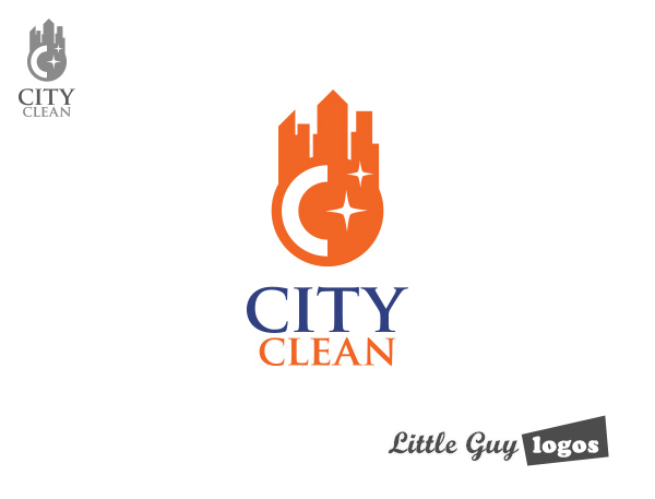
Sitting on top of the world we’ve got a city in which City Clean operates. It’s a fresher logo, both figuratively and literally. The stars allude to the round-the-clock care clients can expect, but they also represent a sparklingly clean surface.

Magnetic Electrical
Magnetic Electrical offers residential and commercial electrical services, including power grid upgrades or transfers, wiring and lighting installations, setups for CCTV videos and smoke alarms, and emergency repairs on switches, fans and power points. Most of their clients in North Queensland, Australia are in the mining, materials processing, manufacturing, and mercantile sectors.
Electrical Company Logo Design
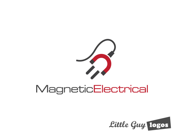
The logo design for this electrical services provider uses two objects, namely a horseshoe magnet with a red U-shaped body and two black tips, and a black electric plug. It also kind of looks like a person, and we liked this human component – it makes the logo and company look friendly and approachable.

Celebrity Extensions
Celebrity Extensions is a world-renowned hair extensions salon that caters to the jet-setter crowd, which include models and famous celebrities.
Hair Salon Logo Design
This logo design for a hair extensions salon deserves a golden star for the woman’s pale gold flowing hair. This is the kind of logo that proudly displays the salon’s unique advantage over others that offer the same services, while appealing to the movie star clientele.


