Society’s fascination with rankings has made ten the standard number of people, items, and entries in competitions that can be declared the best or greatest among those who competed. Another week has gone by and it’s time to reveal the 10th roundup of logo designs that the Little Guy Logos team has marked as their favorite.
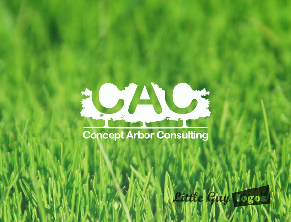
Concept Arbor Consulting
The client provides landscaping and arbor management services.
Landscaping Logo
The logo design shows a trio of large trees with thick foliage with the letters
CAC carved out of the trees. The name of the company in a rounded Arial font is printed below the image.
Lazy Man Games
Lazy Man Games is a new company that organizes social sport outings. To put it plainly, it’s man’s weekend drinking games, and we think that’s brilliant! Hopefully we’ll get a chance to go one day, because when we found out that such a thing existed, we wanted nothing more than PARTY!
Lazy Man Logo
The company name is represented in the character’s pose. It’s an amusing logo with the blue man turning the letter A into a comfy pillow for himself. His lazy pose practically tells you: “Dude, just chill”.

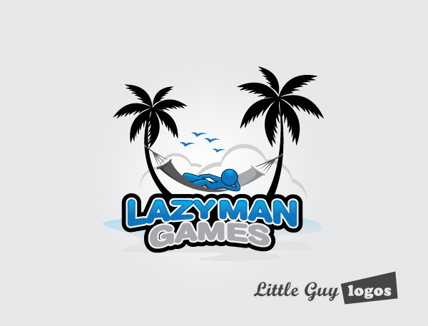
Lazy Man Logo 2
It was important for us to communicate “lazy” in the logo. In this variation we have another blue man resting in a hammock. A hammock is perfect imagery for “a lazy weekend getaway”.
Synchronous Datum Engineering
Synchronous Datum Engineering is a mechanical engineering consulting firm. The company name communicates that information is occurring at the same time. They use parametric b-rep technology and to give their clients the ability to work with synchronous information. What that part means we have no idea, but we do know is that they wanted to see many logo options. Here are our favorites:
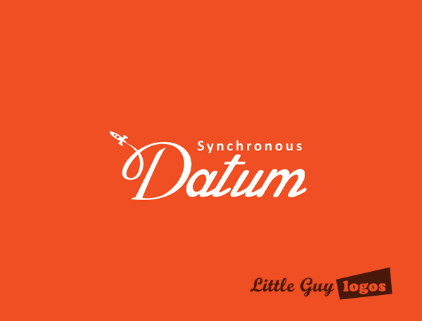
Synchronous Tech Logo
This logo presents the company name in a simple design. Synchronous Datum has a lot of clients in the aeronautical industry, and a small rocket making a loop (and the letter “D”) communicates that industry experience.
Synchronous Tech Logo 2
This was the logo our client chose. The design presents an abstract image of square capsules in orange and black. The black capsules follow a rising plane while the orange capsules are moving downwards in the opposite direction. The overall effect creates an illusion of movement between the two series of capsules. The blocks themselves represent blocks of data, and their movement seems like it’s happening in sync. The image also forms the shape of the letter S.

Synchronous Tech Logo 3
In this version of the Synchronous Datum corporate logo, the word Synchronous lie on the Y axis while the word Datum is on the X axis. The mark consists of vertical bars that represent data the company gathers and analyzes.

Planning Your Logo?
As you look for a logo designer, keep in mind that a designer needs to pair creativity with great technical expertise. For example:
- If the wrong design program is used, your logo will blur when resized.
- If unprintable colors are used, your logo will look wrong when printed.
- If final quality control is skipped, your logo will have costly mistakes.
Business owner trying to save a few bucks just end up paying twice to redo their logo and reprint their marketing material. Avoid surprises, by learning about impossible colors, vector graphics, and the importance of quality control. Learn more


