It’s been a great week here at Little Guy Logos! We’ve found 6 beautiful designs that deserve to be included in the 19th weekly roundup of logos. Look at these beauties and let us know what you think by
liking our Facebook page.
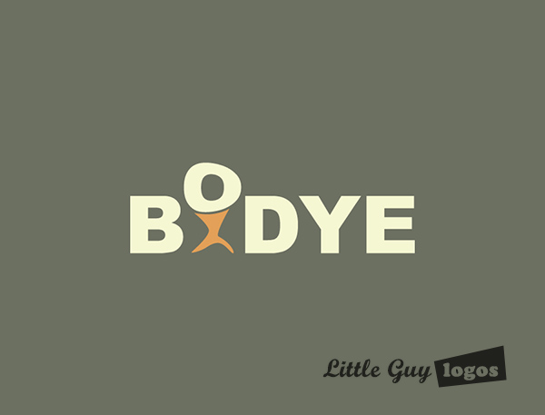
Bodye
This fitness training program develops muscular strength and endurance for strongman competitors. It involves weight lifting with barbells gradually increasing in weight.
Fitness Logo Design
The logo design has a small abstract figure of a strongman lifting the letter O. The letter doesn’t have a perfectly round shape because it represents a boulder – an object typically found in the competitions.
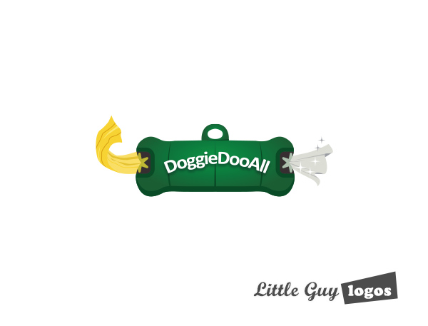
Doggie Doo All
Doggie Doo All are the creators of a little device that a dog would wear on its collar that dispenses plastic bags and wet wipes for the owner to clean up in a safe and sanitary way.
Pet Product Logo Design
This logo was the one ultimately chosen by the client to represent their product. It depicts a cartoon of a dog providing you with a wet wipe and a plastic bag.

Pet Product Logo 2
This is a more literal representation of the product. The logo design is basically a drawing of the cleaning product itself. One end dispenses a clean plastic bag while the other holds and dispenses wet wipes.
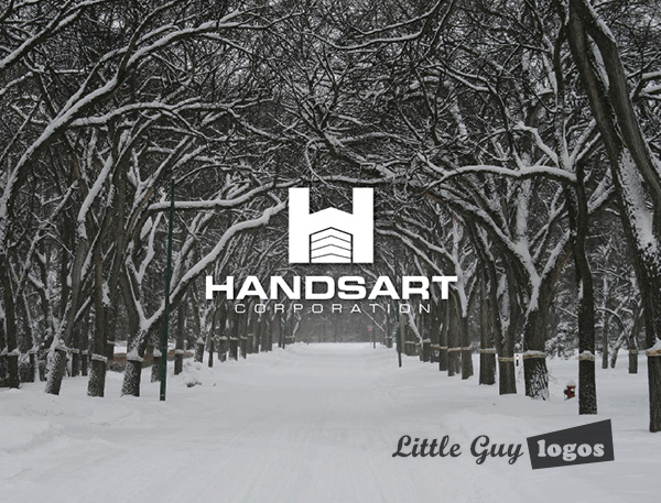
Handsart Corporation
Handsart Corporation is a general asset management company based in Canada. Mostly though their assets are properties, so we designed logos that fit that portfolio.
Real Estate Company Logo
This particular logo design has the letter H surrounding the walls and roof of a small commercial building. It refers to the kinds of assets that Handsart manages for its clients.
Real Estate Company Logo 2
In this version of the Handsart logo, the image has a modern, abstract sketch of a tree on a green background. The tree is something that grows naturally and “growth” is a great concept to communicate for any asset management company. The tree could also refer to the residential properties that Handsart could manage in its portfolio. This is probably our favorite logo out of the three.

Real Estate Company Logo 3
This is a cool negative-space logo design. In the dark letter H, a silhouette of a small house has been “cut out”. Its again representative of the residential properties they manage in their portfolio, and also of growth, because the house looks surprisingly like an arrow that’s suggesting a rise of fortune. Coincidence? NO!

Planning Your Logo?
As you look for a logo designer, keep in mind that a designer needs to pair creativity with great technical expertise. For example:
- If the wrong design program is used, your logo will blur when resized.
- If unprintable colors are used, your logo will look wrong when printed.
- If final quality control is skipped, your logo will have costly mistakes.
Business owner trying to save a few bucks just end up paying twice to redo their logo and reprint their marketing material. Avoid surprises, by learning about impossible colors, vector graphics, and the importance of quality control. Learn more


