That crisp autumn air seems to add a little spring to our steps, don’t you think? Or, maybe it’s just the prospect of seeing another round of beautiful logo designs. The design team of Little Guy Logos has selected these logos based on aesthetics as well as personality.
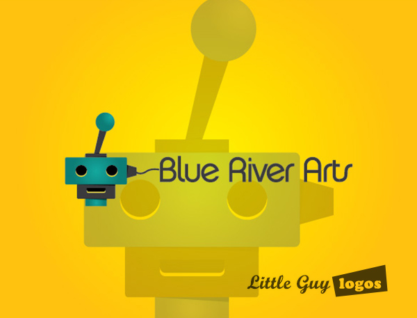
Blue River Arts
Blue River Arts is a young game development studio and idea factory. They’re also the first game development company that requested a logo, so we were excited to take on the challenge.
Game Development Company Logo
The vintage game console in this logo design is made to look like a little robot, and a power plug connects the game console to the text. The purpose of this design was to make a friendly design that communicates gaming in some way – hence the console.
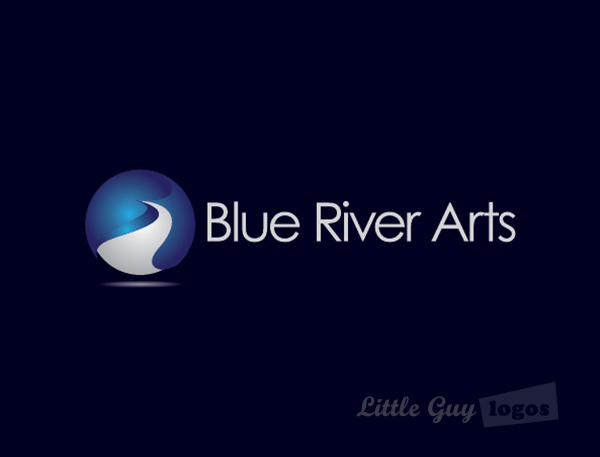
Game Development Company Logo 2
This is a more corporate version of the Blue River Arts logo. The blue-and-white sphere to the left represents the creative flow that the company harnesses when brainstorming new game concepts.
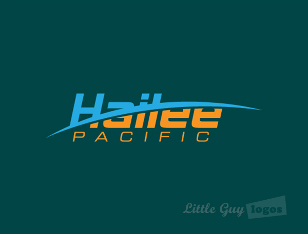
Hailee Pacific
Hailee Pacific owns a multitude of industrial operations including Recycled Plastic Materials, Farm Equipment, and more.
Recycler of Plastic Material
The design for the Hailee Pacific logo is simply made up of stylized text with a wide slash in the middle. Because they have several unrelated operations under the same company name, the goal here was to be ambiguous.
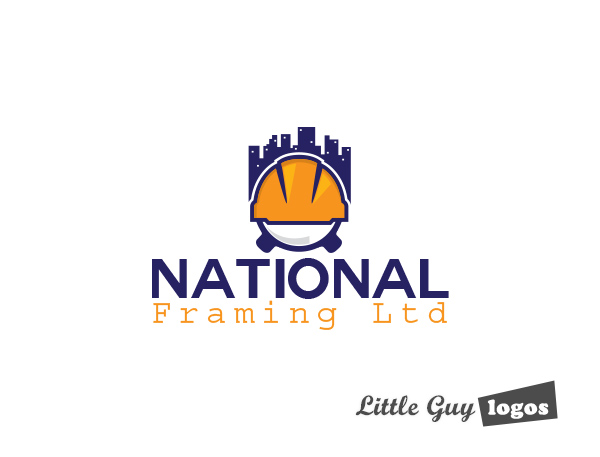
National Framing Ltd.
Our client provides residential house framing services. For his logo he requested only that we include a hardhat somewhere in the logo. Easy!
Framing Construction Company Logo
Here’s one of the designs we came up with. It’s a nice emblem that can go on a uniform sleeve, or on toolbox stickers, attracting attention with its vivid colors.
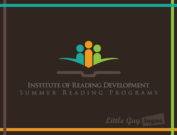
Institute of Reading Development
The Institute of Reading Development works hard to promote the love of reading among children and adults, creating a reading development curriculum for all ages.
Learning Center
The logo for the Institute features abstract human figures that represent children of all ages standing before the open pages of a book. The pages of the book are created out of negative space and frankly look quite cool. The bright colors communicate a youthfulness about the organization, that’s in line with their target clientele.
Planning Your Logo?
As you look for a logo designer, keep in mind that a designer needs to pair creativity with great technical expertise. For example:
- If the wrong design program is used, your logo will blur when resized.
- If unprintable colors are used, your logo will look wrong when printed.
- If final quality control is skipped, your logo will have costly mistakes.
Business owner trying to save a few bucks just end up paying twice to redo their logo and reprint their marketing material. Avoid surprises, by learning about impossible colors, vector graphics, and the importance of quality control. Learn more


