Hey, hey, hey! It’s a great day here at Little Guy Logos! We’re now on our 35th weekly roundup of logo designs, and this week we’ve chosen five of our logos that we think you’ll appreciate for their creativity and friendly design. Check them out and let us know which ones you like on our
Facebook page here.
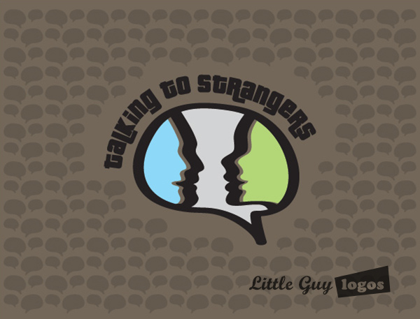
Talking To Strangers
Talking To Strangers is a web series comedy about online dating. Client wanted something simple, but yet something that would still convey that it’s a comedy.
TV Show Logo
This web series logo features two people in profile facing each engaged in some engaging conversation. The friendly colors, talk bubble and font make the design feel light and appropriate for a comedy.

TV Show Logo 2
This design features something that our client specifically requested – paper dolls. So in a web style we’ve got the two human figures holding hands. This is a typical scene that you can expect os see a couple engaged in a first-date (or maybe we can, ’cause we’re players!). And here too the frame is shaped like a talk bubble to resonate the name of the show.

Metro1Realty
M1R prides itself in its ability to provide boutique real estate service at reduced costs. They have partnered with other professionals including attorneys and accountants to provide a one-stop solution for their clients.
Real Estate Logo
The company often goes by “Metro1” so we decided to base our logo mark off that. Our client set the color palette, and all we had to do was figure out the rest :-D. We went on to give the “M” a dual meaning by making the “1” part of the letter and the strong font projects a dependable image.

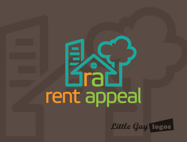
Rent Appeal
Rent Appeal is a property management company that helps people keep their properties in excellent condition.
Property Management Logo
The logo design features a design that’s inclusive of both stand-alone house properties as well as condominium properties. The warm colors create a sense of friendliness and dependability.

Safe Rise Scaffold
Safe Rise Scaffold is a scaffolding company in Australia. Performing installation and repair services high off the ground. These guys are completely unafraid of heights!
Scaffolding Construction Logo
The broad font used for this logo expresses the strength and durability. The stylized text is made to look like its a piece of metal scaffolding, meanwhile the letter “A” in “SCAFFOLD” is shaped like the roof of a house.

Planning Your Logo?
As you look for a logo designer, keep in mind that a designer needs to pair creativity with great technical expertise. For example:
- If the wrong design program is used, your logo will blur when resized.
- If unprintable colors are used, your logo will look wrong when printed.
- If final quality control is skipped, your logo will have costly mistakes.
Business owner trying to save a few bucks just end up paying twice to redo their logo and reprint their marketing material. Avoid surprises, by learning about impossible colors, vector graphics, and the importance of quality control. Learn more


