Hello there! It’s again time to look back at the logos we designed this week. These are some of our favorites and we’re proud to share them with you. This also is our last weekly logo roundup. We’ve had a great run, but now we want to show-off our work elsewhere on the net. Over the past 52 weeks we probably shared close to 300 designs with you, and those you can still check out on our site, but we plan to showoff our new designs on our
Little Guy Logos Facebook page and on various off-site portfolios and logo critique communities that we recently joined.
Meanwhile here is our last roundup:
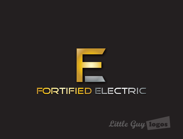
Fortified Electric
Operating in the area of Cambridge, Canada, Fortified Electric is a fully insured and certified electrical contractor that specializes in residential, commercial, and industrial installations. For their logo, our client wanted to stay away from the obvious symbols that electrical companies often use, things like lightbulbs, and lightning bolt were a no-go.
Electrical Contractor Logo 1
Not only did our client want to avoid certain symbols, he also had a clear idea for the overall design. This logo follows his sketch, just give a 3D treatment. The ‘F’ and ‘E’ face each other to create a block, one that suggests strength, and with its thick walls – fortification.

Electrical Contractor Logo 2
Our client wanted to see his vision come to life and 2 more logo concepts according to our own vision. Here’s one design we came up with. Here too the letters ‘F’ and ‘E’ seem to merge into one, but there is a negative-space design in there as well. The inside of the letter ‘E’ looks like a power-plug.
Jack Hunter Engineering
As the name implies,
Jack Hunter offers professional engineering services, tackling projects big and small for their various clients.
Engineering Company Logo
We really like this design. The initials are forged into a clever monogram and can represent our client on their own, or in combination with “Jack Hunter”. Meanwhile the metallic treatment is continued throughout the logo and the company name can be used on its own without the monogram. It’s a pretty iconic mark, and we can’t wait to see the Jack Hunter logo flash on screen in the next Discovery Channel’s
Modern Marvels episode.

Hawk Eye Aerials
Hawk Eye Aerials is a professional drone-operating videography company from Australia. They use drones to capture stunning scenes that would otherwise be impossible to make without a helicopter or a complicated mobile mount setup – both expensive. In other words they make camera affects available to a much wider clientele, like musicians, athletes, and even individuals.
Videography Company Logo
The design is for the most part a visual representation of what the company is all about – providing a multi-propeller drone for videography. The multi-copter is depicted similar to what it looks like in real life, and the camera lens looks like an eye to resonate with the company name, and to visually represent that Hawk Eye Aerials will keep an eye on all the action.

Axyomics
Axyomics is a recently launched division of AXYS Analytical – a company that’s been doing laboratory research for the past 30 years.
Science Company Logo
This is a simple wordmark design. The font gives it a “futuristic” feel to communicate progress. People associate the future with better and cleaner technologies and we wanted to capitalize on that perception and communicate that Axyomics is never stuck in the past. The letter ‘x’ resembles an atom to give the logo a scientific touch.

Planning Your Logo?
As you look for a logo designer, keep in mind that a designer needs to pair creativity with great technical expertise. For example:
- If the wrong design program is used, your logo will blur when resized.
- If unprintable colors are used, your logo will look wrong when printed.
- If final quality control is skipped, your logo will have costly mistakes.
Business owner trying to save a few bucks just end up paying twice to redo their logo and reprint their marketing material. Avoid surprises, by learning about impossible colors, vector graphics, and the importance of quality control. Learn more


