Do you know that the number 6 means smooth-going or well-off in Chinese numerology? Eastern-based numerology attaches positive traits, like peaceful and loving to
six as a number or
sixth as numerical position.
In this sixth weekly roundup of logo designs, let’s see which logos were warmly favored by
Lady Luck with a little push from the most harmonious single digit number, and why we think these logos deserved to be handpicked as the best examples of graphics design this week.
Achilles Fitness
Achilles was the greatest Greek hero in the Trojan War. Since he’s one of the best warriors of Ancient Greece, it’s only right that a warrior-like figure is used for the logo. Our client wanted us to work in the style of the Johnnie Walker logo, and here are two of our favorite designs:
Achilles Fitness Logo Design 1
In this logo, the warrior grasps a long spear in his right hand while he holds a small round shield in his left hand. Although his spear’s pointed downward, the way he keeps his weapon balanced in his hand even when he’s at ease shows he never lets his guard down. He’s ready to face any challenge that comes his way.
If this warrior represents the ideal qualities of an athlete or someone in fitness training, then he’s the embodiment of physical strength, agility, speed, discipline, and mental preparedness. The chosen font pairs well with the figure of the warrior, as both the font and the figure have that sporty appearance.
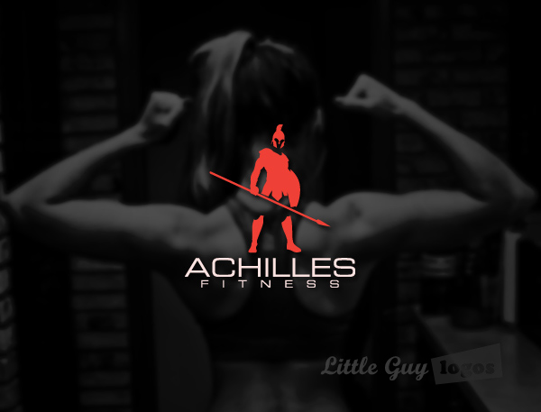
While we could not make up our mind what we like better between this and the next design, it’s this logo that our client chose to represent
Achilles Fitness.
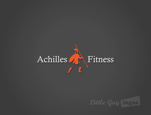
Achilles Fitness Logo Design 2
This is a variation of the warrior. In this design, Achilles stands with his back to the viewer. He still grasps a long spear in his right hand while he holds a small shield in the other. His stance, however, reveals he just sidestepped an attack and is planning a counter-attack.
Alarmex Security
The company provides home security systems to businesses and residences.
Alarmex Security Company Logo
It’s a wordmark type of logo that uses a bold font for the company name. The font appears strong to communicate the strength of the company. And the graphic design in the letter
A of
ALARMEX is like a wall protecting the core.

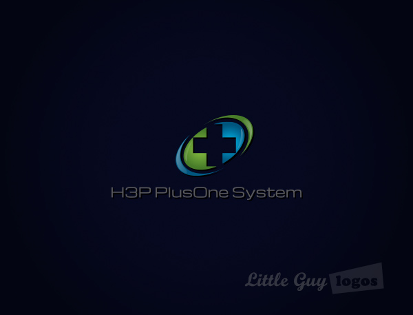
H3P PlusOne System
Our client developed the H3P PlusOne System, which is as a comprehensive web application for medical personnel to use.
H3P Medical Logo
This logo makes use of a variation of the cross, which is an international symbol for the medical industry. The design uses light green and light blue to meet the company color requirements. Meanwhile the glossy edges make the logo look crystal clean and sterile.
Upcycle Alley
Our client requested a custom product logo for Upcycle Alley. She wanted a design that best represented the principle of upcycling, which does more good than recycling or reusing discarded items. This eco-friendly practice converts a useless object or materials into something useful and of greater value.
Upcycle Alley Custom Logo Design
As is the common practice with product logos, this logo design visually represents what it’s about. Essentially it’s an “upcycled” light bulb shell, turned into a small vase for a simple ornamental decor. A sprig of eucalyptus with lavender or similar plants are inserted into the bulb until they’re immersed in water; creating a very interesting decorative piece.
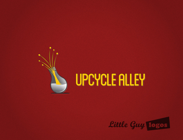
Our client now uses this custom product logo design for all her branding.
Planning Your Logo?
As you look for a logo designer, keep in mind that a designer needs to pair creativity with great technical expertise. For example:
- If the wrong design program is used, your logo will blur when resized.
- If unprintable colors are used, your logo will look wrong when printed.
- If final quality control is skipped, your logo will have costly mistakes.
Business owner trying to save a few bucks just end up paying twice to redo their logo and reprint their marketing material. Avoid surprises, by learning about impossible colors, vector graphics, and the importance of quality control. Learn more


