This week we noticed a theme among our clients. In one way or another they were all about empowering and motivating their clients. Our clients help kids become healthier, assist professionals in finding the perfect job, and aid businesses with their data needs.
They are working hard for their clients and we work hard for ours. Here are our favorite logo designs this week:


 Yoga Kids Logo 2
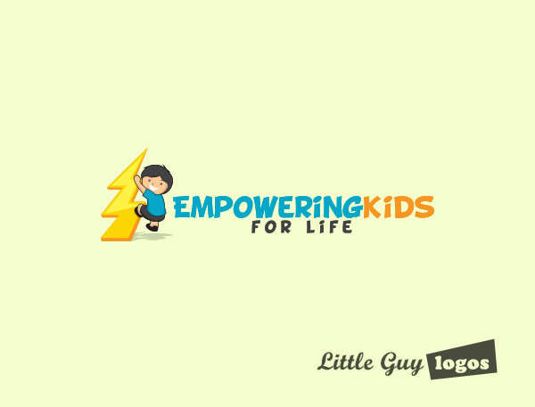
Empowering Kids for Life teaches young children and teens important life skills, such as ways to resolve conflicts between friends or family members. This company also teaches children what to do to manage their anger, how to deal with bullies and bullying, and effective ways to express their thoughts and feelings without resolving to hurling insults, having temper tantrums, or acts of vandalism.
These are complex issues that we did not want to incorporate in our design. Instead we created a friendly logo that features a really happy young boy climbing a lightning bolt. His accent and the lightning bolt are the visual representation of the “empowering concept”.
Yoga Kids Logo 2
Empowering Kids for Life teaches young children and teens important life skills, such as ways to resolve conflicts between friends or family members. This company also teaches children what to do to manage their anger, how to deal with bullies and bullying, and effective ways to express their thoughts and feelings without resolving to hurling insults, having temper tantrums, or acts of vandalism.
These are complex issues that we did not want to incorporate in our design. Instead we created a friendly logo that features a really happy young boy climbing a lightning bolt. His accent and the lightning bolt are the visual representation of the “empowering concept”.
 Yoga Kids Logo 3
In this design, the logo purely focuses on the text – its color, size and style. This workmark has an orange child’s figure with arms and legs open wide to signify freedom in movement. His stance (almost Vitruvian) can also signify that possibilities are endless for a child that’s equipped to face and handle any and all future challenges.
Yoga Kids Logo 3
In this design, the logo purely focuses on the text – its color, size and style. This workmark has an orange child’s figure with arms and legs open wide to signify freedom in movement. His stance (almost Vitruvian) can also signify that possibilities are endless for a child that’s equipped to face and handle any and all future challenges.

Planning Your Logo?
As you look for a logo designer, keep in mind that a designer needs to pair creativity with great technical expertise. For example:
- If the wrong design program is used, your logo will blur when resized.
- If unprintable colors are used, your logo will look wrong when printed.
- If final quality control is skipped, your logo will have costly mistakes.
Business owner trying to save a few bucks just end up paying twice to redo their logo and reprint their marketing material. Avoid surprises, by learning about impossible colors, vector graphics, and the importance of quality control. Learn more


