Wow! I can’t believe nine weeks of hustling and bustling have already gone by. The world of design seems to run on a different clock entirely. Despite the craving for caffeine and the insurmountable sleep deprivation, onward we creatives go!
*heigh-ho-heigh-ho*
And, the roundup of logo designs that we really, really like continues…
The C Word
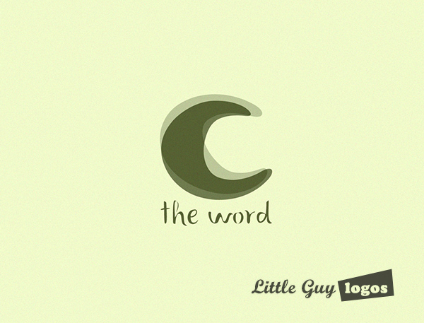
Don’t know what you were thinking here, but the word here is “candles”. It might be a bit tongue-in-cheek, but it’s certainly memorable. This is a small operation that makes and sells 100% hand poured pure soy candles, but they’re growing and wanted a well-made logo for their next big step.
Product Logo
A logo with a clean and simple design contributes to effective branding. People recall a short and simple phrase, like
The C Word. The overlapping shapes add movement to the “C” and we like that because that’s what to us represents a small dancing flame.

Soy Candles Product Logo 2
We liked the 2 parts of the “C” coming together. And the rough edges make it look natural rather than mechanical. The symbol has a clearly legible “C” which is the most memorable part of the company name, and it has a natural look to it, that’ representative of their manufacturing product and the materials they use. The logo can also be seen as shaped and painted like half of a candle, and we like that about this design.

Soy Candles Product Logo 3
In this variation of the product logo, the letter “C” is even more suggestive of a flame. It looks alive, and you might think that if you blow on it, it will move.

Bodimorph Fitness
The owner requested a custom logo for
Bodimorph – a health and fitness Facebook page out of Australia.
Fitness Logo Design
The logo design consists of a man’s silhouette in navy blue surrounded by thick lines of steel blue. The lines represent the excess layers of fat around the body that are being shed. The underlying message was that those layers of fat can be dissolved and hammered into shape through Bodimorph’s health and fitness tips and advice.

Groupets
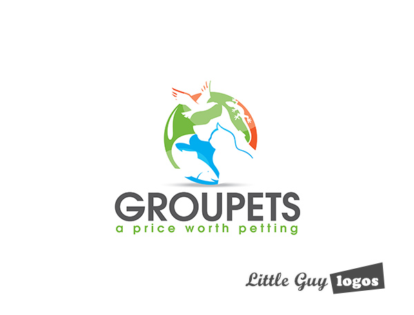
Groupets is a pet food and pet supplies shop based in Canada. They sell food and snacks, toys, grooming products, and other items that pets would want or need.
Pet Shop Corporate Logo Design
Even though our client requested and ultimately chose a design similar to the BestPlay.me design we’ve done (
check out that logo case study here), this design was our personal favorite.
We like this logo design, because it looks like it shines the spotlight on the animals – and that’s what the company is all about. There’s another imagery at play here; the green and blue are common colors to use when drawing the world, and the various animal silhouettes communicate that Groupets provides products for all kinds of animals found on earth.

Planning Your Logo?
As you look for a logo designer, keep in mind that a designer needs to pair creativity with great technical expertise. For example:
- If the wrong design program is used, your logo will blur when resized.
- If unprintable colors are used, your logo will look wrong when printed.
- If final quality control is skipped, your logo will have costly mistakes.
Business owner trying to save a few bucks just end up paying twice to redo their logo and reprint their marketing material. Avoid surprises, by learning about impossible colors, vector graphics, and the importance of quality control. Learn more


